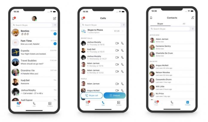
“Calling became harder to execute and Highlights didn’t resonate with a majority of users,” says Peter Skillman, Director of Design for Skype and Outlook. Just a year ago, the new Skype experience was seen as a significant step forward for the app. Microsoft has long been criticized for not developing Skype enough when rivals like Snapchat became popular. Microsoft’s response to almost wholesale copy rivals, such as Facebook Messenger and Snapchat. The biggest update to Skype in a decade changed everything. We got a new UI and features all based on communication being a quasi-social network. Among the new additions were Highlight’s, Microsoft’s take on Instagram’s Stories. Highlights was previously accessed through its own icon in the app. Users could swipe up to call the camera, a more intuitive and rapid action which is part of Microsoft’s “camera-first” design. Once a photo is taken, the image was editable with text, decorations, or other integrations. These images can be shared with group contacts or individuals. “Our new navigation model removes redundant and underused features that create clutter—making it much easier to find the people you want to talk to and contact them in an instant. On mobile we are moving to three buttons at the bottom of the app—Chats, Calls, and Contacts. Removing Highlights and Capture provides a cleaner and more efficient user interface (UI).”
Listening to Users
Users largely rejected Microsoft’s push for Skype to rival social-oriented messaging services. Widespread complaints followed the new experience as it moved from iOS and Android to Windows 10. Last month, Microsoft debuted a UserVoice service for Skype users to suggest new features and changes for the service. This shows the company is listening and dialling back to the old Skype design confirms this.


